Tuesday, April 6, 2010

Brought to You by the Letter....

Today's letter is brought to you by the letter: A.
Twentieth Century, uppercase A, regular.

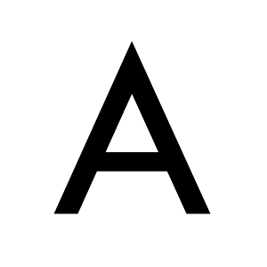
I definitely really like the way Twentieth Century's uppercase A looks. It's got two strong legs to stand on, where the cross bar is positioned creates a good ratio of white space. But I was worried that it was a little boring. It's a geometric sans-serif, and for the most part, it looks like any other geometric sans-serif. But when I got digging, I found some neat information. (Keep reading)

Courtesy of wikipedia.com and briarpress.org

Design Foundry: Monotype
Designer: Sol Hess
Date: 1937-1947
Classification: Geometric Sans-Serif

Okay, apparently, another geometric sans-serif, Futura made an appearance in the mid 1920s for the Bauer foundry before Twentieth Century (1937-47). Tw Cent is just Monotype's version of a geometric sans-serif. There are others to: Metro, Kabel, Spartan, Vogue etc from different foundries. The differences among them are slim. They're just the licensed version for each foundry. Futura and Tw Cent are essentially the Coke and Pepsi of the type world.

Geometric sans-serifs (GSS) were resurrected in the latter half of the twentieth century with type families like ITC Avant Garde, Century Gothic and Avenir. These new GSSs had less stroke variation (notice how the cross bar is slimmer than the legs in Tw Cent) and higher 'x' heights. The increased 'x' heights made them perfect for children's books. This makes perfect sense, because I can't help but look at that Tw Cent 'A' and think ABCs, even though it's such a cold and unfriendly looking A.

Tuesday, March 30, 2010

Brought to you by the letter...


Today's letter is brought to you by the letter: i.
Alfredo, Regular, lowercase i.

The lowercase 'i' is only important because of it's tittle. Hehehe, she said tittle. The tittle is the dot of the 'i'. And it is what keeps the lower case 'i' from falling into obscurity with the lowercase 'l' and amputated capital 'I'. And the fact that it conforms to the x-height (mean line) rather than the cap-line, also differentiates it from the 'l' and 'I'.

What's great about Alfredo Regular's lowercase 'i' is its stature. It leans away on its hind legs, shoulders back, almost ready to topple over, but really it's ganing momentum, ready to spring forward and throw it's tittle at you. I'm 50-50 on whether the stem gets too thin towards the top. This high thick/thin contrast is reminiscent of a modern typeface. I wonder if it's because 400px wasn't the display size the creator was working for.

In addition, I'm not crazy about Alfredo as a typeface as a whole. It's very 60s, groovy, curvy, decorative, but I think the 'i' manages to capture that attitude without being in your face about it. This is one case where the simplicity of the 'i' works in its favor.

Design Foundry: Unknown
Designer: Unknown
Date: Unknown
Classification: Decorative (?)

Hmm... Alfredo is not getting any hits on the Google radar. If anyone can shed light on this typeface, please do! Many variations of the name Alfredo, but no similar characteristics, very different families. I did however find an actor named Alfredo Font, which is kind of great.

Tuesday, March 23, 2010

Brought to you by the letter...

Today's letter is brought to you by the letter: !
Zzzap OT, regular, !

Okay, I know the ! is a punctuation mark, not a letter. And no, I never had any intention of doing anything but letters and numbers. But sometimes, you've got to live life on the fly and go where it takes you. Ha. Anyway. A friend recently referred to me a the type girl (which lighted me up inside! Yay!) and he asked what I would typeface I would recommend for a tattoo. He wants to have Don't Panic! written on his arm, a motto taken from The Hitchhiker's Guide to the Galaxy, and pretty sound life advice in general. I sent him over a list, which included some standard sexy sans serifs like Tungsten and Frutiger. But in the back of my head I kept thinking about Zzzap. A font I've recently become associated with thanks to I Love Typography's nifty Font Game iPhone app.

Zzzap looks just the way it's named, like a bolt of electricity went coursing through the edges of the forms. I think it makes for a more interesting and playful tattoo. Although, it probably wouldn't be a very calming typeface to reflect the message of don't panic. If anything, it'd probably keep you panicked and jostled with it's sharp edges and bold forms. I chose the exclamation point for today's letter (mark) because it that mark sums up Zzzap's electricity. The font might as well have been called Zap! or !!!. I also think the ! shape is particularly interesting the way it resembles an retro-style lightening bolt (again with the electricity theme.)

(On a sidenote, I really think my advice to use his own handwriting or that of his mom--or someone close to him--was pretty spot on. What do you think?)


Courtesy of fontshop.com

Design Foundry: Comicraft
Designer:
John Roshell, Richard Starkings
Date: 2006
Classification: Decorative

Not much info on Zzzap, but the skinny on Comicraft (started by Roshell and Starkings) is that they're one of the first companies with a specialty in digitizing comic book lettering. "The Comicraft studio’s clients include Dark Horse Comics, DC Comics, Marvel Comics, Image Comics, Mad Magazine, Nickelodeon, Graphitti Designs, View Askew, Scholastic, Todd Mcfarlane Productions and NBC."

Sunday, March 21, 2010

Personal Branding - Part III

I know it's common for "part III" to suck. (Read: The Godfather Part III, Back to the Future Part III (?) and surely, there are others.) I'm hoping that my part III does not suck. In fact, I am so bold, as to hope that it's an improvement, a showing of progress. Would leave to hear what you have to say about them. All feedback welcome! Thanks again!


Currently, I'm leaning towards 1 or 3. Still working out the colors. (Note: the reds are supposed to be red, not pink.) Oh last minute edition -- too cheesy or okay?


Let me know what you think!

Tuesday, March 16, 2010

Brought to you by the letter...

Today's letter is brought to you by the letter: Q
Cooper Black, uppercase, Q

Cooper Black may just be the cutest type face there is. It's bold and dark, but so curvy and soft. What's great about the Cooper Black uppercase Q is how, when taken out of context, it's such an interesting shape on its own. It looks like a little baby squid or something. It's stem (?) looks like a wave or some squishy tail. The angle of the bowl and the stem give the shape movement. Although it's dark and bold it's not static. Can't you just imagine a hundred of them floating against a blue background?

The only drawback to being so cute, in my opinion, is being used incorrectly. Cooper Black can easily feel bubbly and childish, too much so to be any good on posters or company collateral or anything. But when I started researching Cooper Black and saw that it was used on the Tootsie Roll packaging and for Garfield books, it clicked. An unusual use of Cooper Black was for Pet Sounds album cover by The Beach Boys. This is one example that shows Cooper Black's versatility. The type face on the cover looks friendly but not cute.

Courtesy of wikipedia.com:

Design Foundry: Barnhart Brothers & Spindler
Designer:
Oswald Bruce Cooper
Date: 1921
Classification: old style serif typeface

"Old style or humanist typefaces date back to 1465, and are characterized by a diagonal stress (the thinnest parts of letters are at an angle rather than at the top and bottom), subtle differences between thick and thin lines (low line contrast), and excellent readability. Old style typefaces are reminiscent of the humanist calligraphy from which their forms were derived."


Courtesy of Linotype.com:
"The flowing outer contours create forms that are both strong and soft, making Cooper Black an extremely flexible font."

Monday, March 15, 2010

New Poster! Gouker's Senior Recital

Hey all, I recently finished my friend Danny Gouker's poster and invitations for his senior recital. Whoo. Check out the poster below.


Tuesday, March 9, 2010

Brought to you by the number...

Today's number is brought to you by the number: 2
Courier New, regular, 2.

Courier New's 2 is cute. Not over the top, trying too hard cute, but just sort of like 4-year-old kid smile cute. I like the slenderness of the shape and slabs. It's interesting how the two end points are rounded yet the bottom left angle was kept flat. It provides a solid foundation for the curve on top. The bottom bar with that tiny tail almost looks like an upside down 7. The flat edge and tail help keep uniformity among all the numbers.

If you don't think a number can be cute, or that that a small detail like a flat edge helps type uniformity, well check out Courier New's 6 and 9 below. Definitely not cute. And something about them doesn't feel quite right with the rest of the type face, especially where the line connects back into the shape nor the size of their bowls.
Courtesy of wikipedia.com, fontco.com and absoluteastronomy.com:

Design Foundry: Monotype (?)
Designer:
(?)
Date: 1992
Classification: Monospaced Slab Serif

Courier was originally a monospace slab serif designed by Howard Kettler in 1955 for IBM's typewriters. Originally the typeface was to be called Messenger but Kettler thought, "A letter can be just an ordinary messenger, or it can be the courier, which radiates dignity, prestige, and stability." Courier New was introduced with the release of Windows 3.1 in 1992. I believe but can't find information to confirm, that the primary difference from Courier is that Courier New is anti-aliased. It's shape doesn't have sharp pixel edges, and smooth (see image below.)

Due to it's monospacing and high contrast, Courier New is often used for web coding and ASCII art. It is usually the recommended typeface for screenplays. And it was used as the U.S. State Department's typeface up until 2004 (when it was replaced by Times New Roman.) Courier New has been updated to version 5.00; which includes over 3100 glyphs, covering over 2700 characters per font.

Friday, March 5, 2010

Photographs

Just for the record, I haven't meant to make this blog solely about "Brought to you by the letter...." I'm working on a lot of portfolio pieces, so expect more posts of me begging for critiques. I've also started taking more photos--which I guess should be published on this blog... but they're not, they're being published at my personal blog, Talking With Myself. I think just because I like the layout over there better. :) One day everything will merge together and their will be peace on earth. Until then, feel free to check out Talking With Myself.

Yours,
Heather

Tuesday, March 2, 2010

Brought to You by the Letter...


Today's letter is brought to you by the letter: F.
ITC Blackadder, Regular, lowercase f.

I haven't done a decorative type face in this series yet, but as soon as I saw ITC's Blackadder, I knew that was about to change. What I really love about ITC Blackadder's regular, lowercase 'f' is how evocative it is. With the flowing, long stem and rough edges, it's the perfect typeface to use when writing that message in a bottle. It's an heirloom, a relic of a time when people wrote by hand, sailed ships to new lands, and said words like wench and booty and Jolly Roger without pretension or irony. Something about the actual shape makes me think nautical. Is it the way the stem leans forward, like a boat that forges ahead? Is it the descended extender that imitates a hook? Or the ascender that evokes a hook for a hand? Or the whole shape that was clearly created with a new quill pen and the finest Indian inks over choppy waters?

I think ITC Blackadder does exactly what type should do--evoke a time, a meaning, a place. Sure, it'll more often be used poorly than well, but occasionally (Pirate Day?) it could be used perfectly. I found this example of a wedding invitation using ITC Blackadder. While the typeface does have a romantic edge to it, I think it feel romantic in a lonely, ennui way, not quite the best subconscious feeling for a wedding. What do you think?

Courtesy of fonts.com and myfonts.com

Design Foundry: ITC International Typeface Corp
Publisher:
Linotype
Designer:
Bob Anderton

Date: 1996
Classification:
Decorative

"It was the eerie transformation of insurrectionist Guy Fawkes’ signature after he was tortured that inspired British designer Bob Anderton’s new typeface ITC Blackadder. Basing his design on hand written letterforms typical of the 16th century, Anderton captured the flurried scrolls and curlicues of the era and then added the sinister tremble that defines ITC Blackadder. This elegant, yet menacing display face is perfect for theatrical uses and scare tactics." - Fonts.com

Monday, March 1, 2010

Personal Branding - #2

Here are some things I've been working on. Feedback would be much appreciated.

The variations between these two are slight. Rather than being solid shapes, they're more dimensional in the second one. What I like about this look, is that I can use the shapes within the rest of the collateral to help create a cohesive look. For example, on the letterhead, I could have a row of little T T T T running across the top. (I don't necesarily want people to read the shapes. It doesn't really spell anything - ucatucd?, which is why I brought them down in value. I just want people to see the shapes. But I wonder if you all tried to read it? I got the shapes by removing the bottom half of the word HEATHER.)

I also wonder if all lowercase is better than title care? When I broke the logos down into their small look, the U with lowercase hv looked very bad. And it would probably be funny to mix the two, yes? And I'm still working out the color schemes. It's probably going to be some version of gray, or yellow or red.

Another sort of twist on the same idea:
This design actually mixes this new dimensional shape with an idea I had earlier, which was to make HV look like a pencil/exacto knife. When I pursued this before, it came out veeeery clip art. See below.


Below are two other previous branding attempts. The first I liked because it feels a bit more personable and less sterile. But it's a very tall logo which I was having issues with. The second one I liked at first, but then someone mentioned "jester" and I couldn't get that out of my head.
I'd really appreciate any feedback, critiques and suggestions. I think doing your own branding is the hardest thing.

Tuesday, February 23, 2010

Brought to you by the letter

Today's letter is brought to you by the letter: C.
Tungsten, Medium, lowercase c.

I recently did some promotional materials at work, and convinced my boss to buy the Tungsten and Vitesse type families, both from Hoefler & Frere Jones. I thought Tungsten had the right look to fit with our sport, MVP concept. Tungsten is strong, it's tough, and compact. It's a man's man's type. It's not the in-your-face, million dollar, football quarterback type, it's the hold-on-to-your-roots, English rugby player type. You know, rugby guys that knock each other around without helmets and pads. That's some tough shit.

What I appreciate about Tungsten's medium, lowercase 'c', is that it is completely indicative of the entire typeface. It's compact--no unnecessary curves here, and means business. It is essentially a visual chain link, the building blocks of industry. This style of sans-serif was common in industrial, constructionist propaganda.
This wasn't a type family that was designed it was built. But rather than being too tough, like an impact or some slab type, Tungsten gets the message across without being intimidating. It's too confident to demand anything. Tungsten knows you'll come along via your own free will.

Courtesy of typography.com:

Design Foundry: Hoefler & Frere Jones
Designer:
Hoefler & Frere Jones

Date: 2009
Classification:
Geometric (?) Flat-sided (?) Sans-Serif

"A few years ago, we started wondering if there was a way to make a typeface in this genre that was disarming instead of brutish, one that employed confidence and subtlety instead of just raw testosterone. Many such designs quit the fight when the going gets rough, abandoning their own internal rules when unruly letters like S or Y won’t conform to the grid — a frailty that’s especially unwelcome in this kind of typeface, whose square-jawed ruggedness would otherwise recommend it for action movies and airport paperbacks. ...The result is Tungsten, a tight family of high-impact fonts that doesn’t sacrifice wit, versatility, or style."

[They have a really nice write up of their font at their site, I recommend you read it.]

Tuesday, February 9, 2010

Brought to you by the letter

Today's letter is brought to you by the letter: M.
Optima, Bold, lowercase m.

It's always easy for me to pick out Optima because although it's a sans-serif, it has a bit of shape to its form. You can sort of see how each leg of the 'm' is not a perfect rectangle, rather they have a slight curve to them from the top of the leg to the bottom (much like flare jeans.) Wikipedia calls it a "swelling at the terminal" which is really a great way to describe it, swelling. The swelling in Optima helps differentiate it from every other sans-serif. Does this uniqueness make for better readability? I don't know, but it does help increase its celebrity in the type world. You can't be famous is no one knows your name. (Note after reading Wiki article, this calligraphic touch to Optima does in fact help legibility!) And speaking of names, Optima also goes by Zapf Humanist because it was a humanist sans-serif created by Hermann Zapf. (You may know Zapf from Zapf Dingbats, he's a big player in the type game.)

I also enjoy Optima 'm's humps. While, I don't mind the slight curve/dip at the very top, starting point of the letter. Although, it becomes much more pronounced at the terminals, particularly in the Black weight (at which I find myself disliking the shape more and more.)


Courtesy of Wikipedia.com:

Design Foundry: D Stempel AG
Designer:
Hermann Zapf

Date: 1952-1955
Classification:
Humanist Sans-Serif

Optima’s design follows humanist lines, but its italic variant is merely an oblique, essentially a sloped roman without characteristic italic letterforms such as a single storey a and rounded base of v and w. This is more typical of a realist sans-serif such as Helvetica or Univers. Also unconventional for the contemporary sans, Optima's capitals (like Palatino's) are directly derived from the classic Roman monumental capital model (one other well executed example is Meier's Syntax). It is clear from the reverence in Zapf's designs that he regards the Roman capitals as ideal forms, and his executions in type prove the thesis. Like Palatino, another Zapf design, Optima is both widely admired and much imitated. Optima and Palatino are trademarks of Linotype (a Monotype company).

Optima is the typeface used on the Vietnam Veterans Memorial.

Humanist typefaces include Calibri, Johnston, Lucida Grande, Segoe UI, Gill Sans, Myriad, Frutiger, Trebuchet MS, Tahoma, Verdana and Optima, a.k.a. Zapf Humanist. These are the most calligraphic of the sans-serif typefaces, with some variation in line width and more legibility than other sans-serif fonts.

Thursday, February 4, 2010

Every Shade of Gray


I am officially announcing, right now, that I am so into gray. Not sure what it is but I really, really really like this color... err shade of black... err tint of white!

Tuesday, February 2, 2010

Brought to you by the letter...

Today's letter is brought to you by the letter: J.
Bodoni MT, Black, lowercase j.

During my typography studies, it was a real a-ha! moment to learn that different weights of a type family were not just thicker strokes or slanted forms, but were in fact sometimes creations all their own. At that point, I thought it was not good enough to just know the letters of a type family in its normal/regular weight anymore. I had to spend time analyzing the different weights because they were in fact different shapes and deserved to be recognized as such. Suddenly the act of creating a type family with 11 variations truly awed me.


Such is the case with today's letter: MT Bodoni's lowercase 'j' in Black. It's a very handsome letter with its descender curling into itself rather than out. This was probably a good choice to avoid it looking too unbalanced. I particularly love how the thin contrasting stroke, common in Modern families, isn't actually a stroke, but rather is represented in the white space that separates the curl and the stem. A small touch of genius. I think it's quite a fine, fine letter.


This curling in also occur in MT Bodoni's 'f' and somewhat in the 'c'. As a result, none of these shapes look out of place within the Black weight or the MT Bodoni family as a whole. By changing the rules for this particular weight, MT Bodoni maintained consistency within the weight, the type family and the type of contrast.

Here's the regular weight MT Bodoni besides its bold and black brethren.Courtesy of Wikipedia.com:

Design Foundry: Monotype has the rights to the Bodoni font (?)
Designer:
Giambattista Bodoni

Date: 1798
Classification:
Didone / Modern Serif


Courtesy of FontCo.com:

"The serifs of Bodoni, in addition to being very thin, are also nearly perpendicular to the main stem, as opposed to the gently sloping serifs of the so-called "oldstyle" typefaces. In addition, the emphasis of stress is very nearly vertical. The result is an overall clean, yet somewhat cold, appearance, both loved and hated by typographers."

About Didone / Modern Serif, courtesy of Wikipedia.com:

"Didone is a typeface classification recognized by the Association Typographique Internationale (AtypI), and part of the VOX-ATypI classification system. It is characterized by slab-like serifs without brackets, vertical orientation of weight axes, strong contrast between thick and thin lines, and an unornamented, "modern" appearance."

Tuesday, January 26, 2010

Brought to you by the number...

Brought to you by the number 5!
GeoSans Light, Regular, 5

The GeoSans Light, regular, number 5 is a robust looking number. I really like the slant of the stem, it creates a sort of motion within the shape, as if the top half is moving ahead, trying to catch up with 6. The slant directs your eye straight to the end of the curve so that you can't help but see the fullness (or rather emptiness of negative space) of the bowl. The top definitely balances the over-sized bowl. I think if the stem was upright, it would look as if the '5' was sticking out its belly and the shape would have a completely different characteristic to it. This '5' is unassuming, yet it feels interesting and modern.

From Da Font.com

Design Foundry: ---
Designer: Manfred Klein
Date: pre-2005
Classification: Sans Serif

Not much information on GeoSans Light or on Manfred Klein. Klein appears to be a German typographer. But I don't read German, so I can't provide much information. Sorry! But he has a whole lot of type families that you can check out at: http://manfred-klein.ina-mar.com/

Tuesday, January 19, 2010

Brought to you by the letter...


Today's letter is brought to you by the letter: T.
Interstate, Regular, lowercase t.

What stood out to me about Interstate Regular's lowercase 't' was the ends of its stem. For a sans serif, it adds a little pizazz to have the top cut off at such an extreme angle, and for the bottom of the stem to curve and cut off at a lesser angle. It could have been a very bland, equal weighted, cross shape--just another letter in the alphabet--but it was obvious that this 't' was crafted with care. The terminal curve and angle plays very nicely with the erect stem. This letter says I'm a good school boy, but I'm fun too!

Even thought it feels neo-grotesque in it's lack of contrast and even width, it certainly has a distinguishing characteristic. Although, perhaps to people not in love with letter forms, maybe it does look rather inconspicuous?

Courtesy of Font Bureau.com:

Design Foundry: Font Bureau
Designer:
Tobias Frere-Jones
Date:
1993-1999
Classification:
Neo-grotesque sans-serif

"Familiarity lies at the heart of legibility. Interstate is based on the signage alphabets of our Federal Highway Administration, letterforms absorbed at a glance everywhere we drive. Interstate provides a real edge in swift communication." Interstate is recommended for newspaper and magazine use. Interstate has 40 different weights!


Courtesy of wikipedia.com:

The terminals of ascending and descending strokes are cut at an angle to the stroke (see lowercase t, and l), and on curved strokes (see lowercase e and s), terminals are drawn at a 90° angle to the stroke, positioning them at an angle to the baseline. Counters are open, even in the bold and bold condensed weights, further contributing to legibility.


About Neo-Grotesque Sans-Serif, courtesy of Para Type.com:

Neo-Grotesque is a refinement of early Grotesque structure. They were issued during 1950s due to the requirements of the Swiss typography style. Neo-Grotesques are more elegant than their predecessors and hardly have any distinguishing features, so may be described as standard and inconspicuous. They have small aperture, even widths, low contrast and large x-height. They were designed in many styles and weights. Ascenders are the height of uppercase. Normally italic is absent or replaced by oblique. Slopes are from average to significant.

Tuesday, January 12, 2010

Brought to you by the letter...

Today's letter is brought to you by the letter: M.
Futura, Medium, M.

What I like most about the Futura 'M' is that it's unapolegetic--no soft curves, no humps or bumps, just three sharp points. It's like Futura 'M' is saying, if you mess with me, I will cut you. It's shape doesn't fall into the trap of looking like mountains, it's not a mountain, it's a letter and 'M' knows it. It's not trying to be anything besides a legible, no frills, geometric letter. The thick black lines make out two isoceles triagles--our eyes filling in the baseline--and the white space under them make two more. I also like how the middle downward point just crosses the baseline. Trying to be a little rebellious, are we 'M'?

Courtesy of My Fonts.com:
Design Foundry: Bauersche Giesserei / Bauer Types
Designer: Paul Renner
Date: 1927
Classification: Geometric Sans Serif

Courtesy of Wikipedia:
About: Futura is based on geometric shapes that became representative visual elements of the Bauhaus design style from 1919-1933. Futura has an appearance of efficiency and forwardness. The typeface is derived from simple geometric forms (near perfect circles, triangles and squares) and is based on strokes of near-even weight, which are low in contrast. This is most visible in the almost perfectly round stroke of the "o", which is nonetheless slightly ovoid. In designing Future, Renner avoided the decorative, eliminating non-essential elements. The lowercase has tall ascenders, which rise above the cap line. The uppercase characters present proportions similar to those of classical Roman capitals. Original Futura design also included small capitals and old-style figures, which were dropped from the original metal issue of the type. The digital versions of these glyphs were first produced by Neufville Digital under the Futura ND family.

Tuesday, January 5, 2010

Brought to you by the letter...


Today's letter is brought to you by the letter: G.
ITC Cheltenham, Book, lowercase g.

ITC Cheltenham Book 'g' is kicking off this new series exploring type because quite frankly this is the letter that inspired it. I want to learn more about fonts and typefaces, so I figured why not spend one day a week talking about a certain letter/typeface. (I already have a new typeface project in the works, but I'll share that little secret on another post.) You'll have to excuse me if I use the wrong terminology, but please do correct me.

What really caught my eye on this 'g' is the open-bowl ascender. That's what really separated it from the numerous other serif typefaces I was copying at the time. (My typography teacher once made us trace over the letters of five typefaces to learn the shapes, contours and minute differences. I absolutely loved this meticulous task, so I continue to trace.)

The ascended-bowl opening creates a more interesting white space that juxtaposes with the trapped white space of the top bowl. And then there's the perfect, strict stem (?) that connects the two curvy sections. It's a perfect synthesis of contrast. Plus, it's ear (or terminal) is pretty cute.

A very brief history of ITC Cheltenham Book courtesy of font.com:

Design Foundry: ITC - International Typeface Corp.
Designer: Tony Stan
Classification: Clarendon Serif which means strong vertical weight stress; usually with heavy, bracketed and square-cut serifs

About: The original Cheltenham was designed by the distinguished American architect, Bertram Goodhue in 1896, for the Cheltenham Press, New York. Generally stronger in appearance than the popular text types of the time, the ITC Cheltenham font family has a large x-height that adds to its legibility in text settings.

What are your takes on the 'g'?

Sunday, December 27, 2009

Promises and promises

Okay, so I've done this before, all promising things (like a website) that haven't come to fruition. Well, you've got to cut me some slack. I've got a lot of things going on--including laziness, which I am doing my absolute best to correct.

Here are some upcoming things that I'm planning for the blog:

- The letters: a weekly post about my favorite letters and a short bit about why.

- Inspired or insipid. I post one thing that I found truly inspiring and explain why. You leave a nice or nasty comment saying if you agree.

- A 365 project: either photography, drawing or design, or maybe some combination of both. I'll spare showing all seven days work of work (I'm sure some of it will be sub par - it is okay to fail) and just post my favorite for the week.

More explanation will be provided upon commencement. I will totally assign arbitrary days to these weekly posts (I'm thinking Tuesday, Friday and Sunday in that order). I do plan on cleaning up the blog and building a website, so put that into the plan for 2010.

Tuesday, December 8, 2009

New Personal Logotype

Since the summer, I've been working on a logo. And I've come up with plenty. Unfortunately, they've run the gammit from clip art-ish to so-so. I'd like it a lot once I was "finished" with it, after tweaking it for hours. But I think I finally have one that I'm ready to share. I'm pretty happy with it. I haven't decided on a color palette yet, so for now, you get to see it in it's rawest form: black on white. (The best and true way to judge the value of a logo.) Please, feedback, gimme gimme gimme!


Maybe you noticed that those are actually two different logotypes (good eye!). Or at least two different typefaces. The first one is Trade Gothic in light which has a great 'g' (not shown). (I bring up the 'g' because my variations of this logotype include the words design and photography.) The second typeface is Drescher Grotesk BT in Light which has a great ampersand (not shown). I think I lean a bit towards the 'a' in Drescher Grotesk as well. What do you think?!

Whatever words of wisdom or catty critiques you might have, I want to hear it all. This is my first time around and I'm still working on it. So I won't take too much offense. Thanks!