My Dear Guests,
For nearly three years I have enjoyed your company here at my home, The Gray Suite. But due to the failing economy, The Gray Suite has been foreclosed on, and will be closing it's design shutters for good.
Okay, enough with the metaphor. Yup, this will probably be the final post on The Gray Suite. But don't worry! You can still get your almost weekly design ramblings from me, just not here. Ta da! My Portfolio Site included with blog, will now be host to all these posts and all the ones to come in the future. There's even a new Brought to you by the Letter post today! (Psst, it's Silom's lowercase 'x'.)
So, update your RSS feeds or Google reader or whatevers with the new blog address: http://www.heathervandemark.com/blog/ and then get over there! Cheers and hopefully see you again! Don't be a stranger.
Yours,
The Lady of the House
Wednesday, September 1, 2010
Wednesday, August 11, 2010
8Faces Issue 1 Review

I had the luck to purchase a print copy of the new, limited-edition, typography magazine, 8Faces, before it sold out. And I can't tell you how ecstatic I am that I did. After pouring over it for the past 48 hours, I have a few things to say.
First, I think I'm so in love with it, because I received it literally a day after I sketched out the ideas/concepts for my first (three!) typefaces. I was playing around with custom lettering for some thank you cards, and the next thing I know I was swarmed with ideas and sketching letter forms left and right and technical notes as fast I could. So, to receive a typography magazine the next day added much fuel to the fire.
Some really cool things in 8Faces, Issue 1:
- Interview with Jessica Hische who's Daily Drop Caps and hand lettering-style are going to be subject of my Inspiration #2.
- It's incredibly well-written. John Boardly of ilovetypography, wrote a short article "Type Matters," and he compares the invisible technical details of a typeface that go undistinguished by readers to the way a seasoned chef adds salt to a dish to enhance the flavors but without the diner tasting the salt.
- I love that the interviewees had different opinions on the future of web typefaces and how they should be distributed/owned. Many of them had their hands in different projects such as TypeKit, FontShop, League of Moveable Type, etc. It's very unbias journalism that expresses both sides of an issue without taking a side. And everyone was very respect to each other. Ah, civil debate, how I've missed you!
- My favorite quote comes from Ian Coyle's interview. He says, "When a client comes to a designer - to any creative - it's not just the output; it's about the person: the way they think and the way they approach the work. ...And that only comes from thinking." He nailed it perfectly. When I read that, I thought back to myself about all those times when people said I think too much (as a bad thing) and relished that I have this ability.
- Lastly, they also interviewed Brian Willen and Nolen Strals, who to my amazement are here in Baltimore! They teach at MICA and wrote Lettering & Type (which I am familiar with.) So this was exciting, and a happy surprise/nod to the design community of Baltimore. Yea yea.
Essentially, 8Faces interviews 8 different typographers or design-extraordinaires and ultimately, asks them, "If you could you just 8 typefaces for the rest of your life, which would you choose?" I absolutely loved reading this spread after each interview, to see what typefaces overlapped and more interesting what the departures were. The departures were usually ones that achieved a personable sentiment between the designer and the typeface. It definitely opened up my eyes to some typefaces that I had overlooked. Georgia got brought up a lot as the go to web-safe font. I'm not sure how I feel about that!
8Faces, issue #1 is still available for PDF download if you're interested. I have to say I wouldn't want to read this in any other way than in print. Sometimes, when I'm at the airport or Barnes & Noble, I think to myself, I want to support the print industry, I love print, I'll buy some cool design magazines. And so often I am disappointed at the selection! But 8Faces is awesome because it's informative, well-designed and not-pretentious. I particularly like that's it's not pretentious. And there are extra goodies in it besides the 8 interviews, like a featured art piece, a chance to win something, etc etc. I strongly urge all of you - if you have even a slight interest in typography - to get your hands on Issue 2.
Tuesday, August 10, 2010
Brought to You by the Letter...
 Brought to you by the Letter: B
Old Standard TT, Regular, uppercase B
Of all the Google Font Directory typefaces, Lobster has got to be the most widely used so far online. Or maybe it's just so distinct that I notice it more often than say Old Standard TT. Lobster, by Pablo Impallari, is a really fun decorative script font. Something about it feels like summertime. The details - the loops and thick curves, the way the letters run together as there's something a little urgent and exciting. It all feels very vintage to me, maybe the 70s? I want to see the words Psyche! and Chill and Get Down written in Lobster in shades of burnt orange and mustard yellow with thick white strokes. And then it sort of hit me, Lobster reminds me of the typeface for the logo of those colorful Spanish lollipops, Chupa Chups. I can see some resemblance in style:

Extra awesome about the Chupa Chups logo: it was done by Salvador Dali in 1969. Thank you Wikipedia.
But on to the Lobster, regular uppercase B. I started doing some digging and Lobster is not only a very pretty font, but a very well-made font. I say this because a lot of care was taken into creating alternate versions of the letters (79 ligatures so far) that help finesse the font's handwritten feel. For example, notice the details of the B above: The stem and the curves connect in only one place, both bowls are open. However, notice the differences among the B ligatures below (These are displayed in Photoshop if you want to see it for yourself). The black type shows Contextual Alternates, the red type shows Standard Ligatures, and the blue shows Stylistic Alternates. Notice on the blue type how the bottom bowl connects to the stem. (More changes occur with the other letters, but I want to stay focused on the B.) This attention to detail is what makes Lobster stand out as a well-designed typeface, and it makes sense why everyone is jumping at the chance to use it.
 Courtesy of Google Font Directory, Impallari.com:
Design Foundry: Impallari
Designer: Pablo Impallari
Date: 2010
Classification: Decorative - script
You can find a lengthy and interesting description about Lobster from the creator himself here. An excerpt explaining what I mentioned above about the ligatures more in depth:
"A common problem that affect most script fonts, is that each letter must be draw in a way that connect with the next and previous letters. And that's quite difficult.
By having 26 lowercase character, that gives you more than 600 possible combinations for each letter (and arround 15600 for the whole alphabet). It's next to impossible to make it always connect seamesly whitout compromising the shape that each letter was originally intended to be.
That's why trying to make script fonts works it's like magic."
Impallari also released the typeface at Typophile, and it's interesting watching it develop in this forum here. The one thing I've gathered from the writing about Lobster, is that it is very much a collaborative effort. Although Impallari may have been the only one touching the letters, commentators and typography gurus had a lot of influence on the final design.
Tuesday, August 3, 2010
Brought to you by the letter...

Brought to you by the Letter: D
Old Standard TT, Regular, lowercase d
Old Standard TT is another typeface available in Google's Font Directory. The lowercase 'd' feels particularly timeless, and I don't think the rest of the typeface translates quite as well. Although, the ascender is a little short in proportion with the x-height, which is uncommon (even disliked?) to see today in contemporary typefaces.
To be honest, I don't have strong feeling about this 'd', I just knew that I liked it when I saw it. Mainly, I thought the top and bottom brackets pointing in different directions was sort of funny. Like the hand gestures for that 80's Dance Like an Egyptian song. But after I checked out some other serif typefaces, I see that that's the norm for lowercase ds. Nevertheless, I stick by the Old Standard TT, lowercase d.
Oh, I will add that I think the typeface works better on the web at larger sizes. The smaller sizes start to have anti-aliasing issues and look a little fuzzy. You can see Old Standard TT at different sizes on the Google Font Directory page. (Better information below!)
Courtesy of Font Squirrel, The Salonnica
(You can download the font from Font Squirrel)
Design Foundry: Paratype (?)
Designer: Alexey Kryukov
Date: 2006-2009
Classification: Modern Serif
Old Standard was very common in the late 19th and and early 20th centuries for Biblical, classical and medieval reproductions. This association makes it a particularly good choice for scientific papers (particularly social and humanitarian sciences) because Old Standard's "specific features are closely associated in the people's eyes with old books they learned on." Old Standard is also a good choice for Greek and Cyrillic works, because Greek and Cyrillic lettertypes were based on the same classicist style. (The classification of "Modern" is based on the style, not the time period.) Old Standard includes over 1,400 glyphs to cover Latin, Greek and Cyrillic characters.
Saturday, July 31, 2010
Inspiration Series #1: BHoff, Dribble and Website Design
I've been meaning to create a portfolio website for years now. Every summer and winter break during grad school, I would think, yeah, I'll finally get my site done! And sure enough weeks would go by, and it just wouldn't happen. But during the final semester of my grad program--on top of all the other work I had to do to finish--I thought, okay I am going to do it. And after a night's worth of work, I designed my site.
And it was hideous! It was boring, it had obnoxious web 2.0 trends, it was disjointed, and more importantly, it didn't reflect me or my aesthetic. And the only way I came to this realization was through a little inspiration from Brian Hoff's redesign of his blog, The Design Cubicle.
Mr. Hoff (I don't know him, so I just can't call him Brian) posted some of his Dribbble snapshots of his site redesign on Twitter.
[NOTE:Dribbble is an invite-only showcase website for designers to show off their current works in 400x300 px squares. I've yet to receive my invite, ahem, so I've been hanging out and sharing my design snapshots at Forrst instead.]


And I loved them. The color palette was unique and fantastic. The fine details along the content margin.The textures and layers. Every detail was clearly a conscious choice. And I felt like I got a sense of this guy from this design. These tiny snippets made me excited not only for rest of his site, but also about design in general. Here's a guy who thought about the design and the usability, and not once or twice, but so many times until every piece fell into place. And you can see the finished result here: The Design Cubicle And yes, this site looks so good, I want to have sex with it. It is just so spot on.
As a writer, I'm used to rewriting a single sentence ten times to find the perfect word, the perfect rhythm. But I haven't quite taken that same editing mentality to my designs - especially my own branding, and I know I need to.
So I tossed out my old design and started again. I had to address the real crux of my problem: What is my design aesthetic? What do I want my website to say about me? What do I like about design?
Here are some of the things I wrote down:
1. I like type solutions (but need to learn more about typography)
2. I like taking photos (but don't have a voice yet)
3. I like clean, minimal and modern
4. I like fancy, complicated prints (but haven't done any myself)
5. I like writing and editing and critiquing
6. I like things to be thoughtful
And after contemplating what I had written for a while, it started to come together. I wanted something authoritative (#1, #2, #4). I don't know everything yet (and I'm still learning), but I want people to feel confident that I do. I wanted people to land on my website, and think oh, this is put together (#6). And I realized that perhaps a photo solution would be a good solution for me (#2).
I don't want to give away all the surprise about my new site (which should be up soon!), but here's a brief idea of what went into it: Taking photos, editing photos, working them into the site, type choices, type changes, layout choices, layout changes, choosing color palette, reworking the photos, choosing portfolio pieces, finding stock photos, editing stock photos, figuring out hovers, making social media icons, redoing the footer, etc. etc. (Then repeat for the blog design.)
And I know some of you might be rolling your eyes going, sheesh this is what you should be doing for every design concept Heather. And yeah, I know, thanks. But "should" doen't mean I always do, and I doubt you do all the time either. Especially, when it comes to our own work. When it comes to our own branding and identities, some of us get blinded by our own egos, and others throw themselves into client work just to avoid it. Either way, designing for ourselves gets treated differently. And differently shouldn't mean poorly.
For those of you who prefer a visual representation, here's a few Dribbble-esque 400 x 300 px snapshots of my own:


And it was hideous! It was boring, it had obnoxious web 2.0 trends, it was disjointed, and more importantly, it didn't reflect me or my aesthetic. And the only way I came to this realization was through a little inspiration from Brian Hoff's redesign of his blog, The Design Cubicle.
Mr. Hoff (I don't know him, so I just can't call him Brian) posted some of his Dribbble snapshots of his site redesign on Twitter.
[NOTE:Dribbble is an invite-only showcase website for designers to show off their current works in 400x300 px squares. I've yet to receive my invite, ahem, so I've been hanging out and sharing my design snapshots at Forrst instead.]
And I loved them. The color palette was unique and fantastic. The fine details along the content margin.The textures and layers. Every detail was clearly a conscious choice. And I felt like I got a sense of this guy from this design. These tiny snippets made me excited not only for rest of his site, but also about design in general. Here's a guy who thought about the design and the usability, and not once or twice, but so many times until every piece fell into place. And you can see the finished result here: The Design Cubicle And yes, this site looks so good, I want to have sex with it. It is just so spot on.
As a writer, I'm used to rewriting a single sentence ten times to find the perfect word, the perfect rhythm. But I haven't quite taken that same editing mentality to my designs - especially my own branding, and I know I need to.
So I tossed out my old design and started again. I had to address the real crux of my problem: What is my design aesthetic? What do I want my website to say about me? What do I like about design?
Here are some of the things I wrote down:
1. I like type solutions (but need to learn more about typography)
2. I like taking photos (but don't have a voice yet)
3. I like clean, minimal and modern
4. I like fancy, complicated prints (but haven't done any myself)
5. I like writing and editing and critiquing
6. I like things to be thoughtful
And after contemplating what I had written for a while, it started to come together. I wanted something authoritative (#1, #2, #4). I don't know everything yet (and I'm still learning), but I want people to feel confident that I do. I wanted people to land on my website, and think oh, this is put together (#6). And I realized that perhaps a photo solution would be a good solution for me (#2).
I don't want to give away all the surprise about my new site (which should be up soon!), but here's a brief idea of what went into it: Taking photos, editing photos, working them into the site, type choices, type changes, layout choices, layout changes, choosing color palette, reworking the photos, choosing portfolio pieces, finding stock photos, editing stock photos, figuring out hovers, making social media icons, redoing the footer, etc. etc. (Then repeat for the blog design.)
And I know some of you might be rolling your eyes going, sheesh this is what you should be doing for every design concept Heather. And yeah, I know, thanks. But "should" doen't mean I always do, and I doubt you do all the time either. Especially, when it comes to our own work. When it comes to our own branding and identities, some of us get blinded by our own egos, and others throw themselves into client work just to avoid it. Either way, designing for ourselves gets treated differently. And differently shouldn't mean poorly.
For those of you who prefer a visual representation, here's a few Dribbble-esque 400 x 300 px snapshots of my own:
Tuesday, July 27, 2010
Brought to You by the Letter

Brought to you by the Letter: K
Josefin, Regular, lowercase k
As you may or may not know, web sites are in some ways limited in what sorts of typefaces they can use/display. This handful of fonts are called "web safe fonts." However, with more and more print designers moving to web, a limited number of fonts has just become unacceptable, and there are a few ways to get around using just the web safe fonts and instead using some wicked cool fonts (without saving them as an image).
Google recently got into the game with the Google Font Directory. It currently includes 18 open-source fonts that Google actually gives you the code to embed the font into the site. That way, no matter the browser or computer platform, the font is available through the site and thus loads and displays correctly. Over the next few weeks, I'll be plucking some of the letters from the Google Font Directory.
This week is Josefin's regular, lowercase 'k,' which I am seriously loving as a letter and a typeface. Although, I would make a desperate plea to @sannorozco to please make/finish the bold and italic weights. It's just such a lovely, lovely typeface that additional weights would make it quite versatile.
What I like about Josefin the typeface is how "delicate, yet assertive" it is and "geometric, yet decorative." (the maker's own description.) It's a dressed up sans-serif. Josefin is Futura's date on a Friday night, wearing a little black dress and drinking dirty martinis.
What struck me about this k is it's hard, razor-like angles, and legs going everywhere. It looks the way a 'k' sounds, which to me makes me think of Korean characters, which were designed to look the way the mouth is shaped when pronouncing the letter. (So I can't help but feel like the shape has some Asian influence.) And while the 'k' doesn't look like the tongue's movement or anything, it does look like the sound k-k-k-k-k-k-k. Hard and awkward (and not boring looking). And Josefin's 'k' still manages to be so clean and concise and modern. Is it an abstract house or tree or some ancient hieroglyphic? The 'k' looks like it's from another time. The white space is perplexing and it should be because 'k's are.
Courtesy of Typemade.mx
(You can download the font there at the bottom of the page)
Design Foundry: Typemade
Designer: Santiago Orozco
Date: 2010
Classification: Geometric, Decorative Sans-Serif
"The idea for create this typeface was to make it geometric, elegant and kind of vintage, special for titling. It is based on 1927 Rudolf Koch's Kabel, 1930 Rudolf Wolf's Memphis, 1927(?) Paul Renner's Futura.
"My idea was to draw something with good style, specifically that reflects the swedish design and their passion for good lifestyle, and by default all other scandinavian styles."
Monday, July 26, 2010
Inspiration Series
I've noticed that there are a lot of "Inspiration" posts on the web. They're usually just image after image of "inspiration." (Half the times the links are broken and I can't even see the whole image or original site, and it's actually incredibly frustrating - but that's another post.) And while, I like to browse these images, and while I appreciate them, am excited by them, am moved by them, I don't necessarily think of them as inspiring.
Granted, this might just be a case of semantics, but for me, deriving inspiration from something means to A. use one of my five senses to register something into my brain, B. be moved by that something, and most importantly, C. create something new intentionally based off of that original something. This to me is what inspiration is all about. Because we all get 500 ideas a day that are spurred by the things we see and interact with daily, but it's not enough to call it inspiring if it doesn't move you to actual make your idea a reality. I don't think a poet would call the sun an inspiration if they weren't also writing poetry about the sun.
Now you can argue that you could see a flurry of images on one of those design inspiration posts (or even in an art museum) and that they'll subconsciously influence your work from then on. And that's totally true, I agree, but that's more influence than inspiration... ? But there's also something wonderful about creating something that you can pinpoint to a moment of inspiration, a moment of a-ha. I think being influenced by 20th century art is different than being inspired by painting XYZ by author ABC.
Again, I might be running in circles and you might not see the difference, and that's no big deal. To an extent, I'm just rambling here. I'm also introducing a new series to The Gray Suite: The Inspiration Series (great name right?). So be on the look out for these, they won't be weekly, but hopefully at least monthly. I'll create something and discuss my process on how I went from the thing of inspiration to my creation and why.
Tuesday, June 22, 2010
Brought to you by the letter...

Brought to you by the letter: B
Bauhaus 93, lowercase, regular b
Bauhaus is ones of those typefaces every designer needs to know. I'd even go so far that it's a typeface that everyone should know, but that's a very special classification mainly left to Helvetica, Arial, Times New Roman and Comic Sans, but I digress.
Personally, I don't think Bauhaus is all that pretty or useable. It's round and approachable without being childish. It's a little quirky the way the shape never really connects to itself. It feels simple but it's not. And when used in a certain way, Bauhaus can even feel distinguished. But like my earlier post on the typeface Broadway, Bauhaus is much more than a distinct visual face. Mainly because the typeface is held in esteem as a representation of a larger art movement of the same name.
Bauhaus comes from the German school of Staatliches Bauhaus which combined arts and crafts and fine arts in the early 20th century. The main theme of the school was to include all types of art in one roof (design, architecture, textiles, decor etc.). As a result, the Bauhaus became a movement as thinkers and makers from this time and school proceeded to go and influence many different art disciplines. Modernism played a large part in the Bauhaus school of thought, and I definitely think that's reflected in the Bauhaus typeface.
Courtesy of Wikiepedia.com:
I'll skip the regular breakdown of foundry, designer etc. And just give you a timeline instead since it's a bit confusing. In 1925, Herbert Bayer created Universal. Bauhaus is based off of that. There's also Burko Bold which is an unfinished Bauhaus design. Blippo was created in 1969 for Fotostar by Joe Taylor as a black weight to Burko Bold. Bauhaus 93 is a variant of URW Blippo Black. ITC Ronda gave lowercase letters to the family. ITC Bauhaus was finally created in 1975 by Edward Benguiat and Victor Caruso. Not going to lie - none of this is particularly clear to me - or at least the differences among each of these is not clear. But in a nutshell, Bauhaus in some form or another, has been around since the 1920s.
More interesting! Bauhaus was the typeface used for The Jeffersons and Roseanne title sequences. It was also used in Walt Disney World signage. And more recently, it's used sometimes in Homestar Runner titles. Whoa!
Wednesday, June 9, 2010
Brought to You by the Letter...

Brought to you by the letter: H
Vitesse, regular, uppercase H
As a Heather, I have a very long history with the uppercase H. And I've always sorted of hated it. It's blocky and big and boring. It has no finesse, no style. But Vitesse's uppercase H takes the boring blockiness of the H and gives it some style.
I know you might be thinking that all slab serif Hs are all the same, but that's not true (see the bottom of this post.) Vitesse H feels sporty and spirited. It may not be the all-star character of the typeface, but it's the supporting player who grounds all the others. I definitely think a 3 pt stroke around it would scream varsity/university letter. (Not that I recommend doing that to this shape.) While I'm not super into sporty, collegiate typefaces, I think this one is a very modern, usable typeface.
Courtesy of typography.com:
Design Foundry: H&F-J
Designer: H&F-J
Date: 200?
Classification: 21st century slab serif
"Noting that nineteenth century designs were based on the ellipse, and twentieth century ones on the circle, we wondered what other geometries might prove similarly fertile, and were inexorably drawn to the rounded rectangle. Surprisingly, this attractive and familiar shape, so iconic of both the industrial and digital eras, has seldom been employed typographically as anything more than a novelty.
"The design that emerged has many of the qualities of a beloved sports car: Vitesse is agile, steady, suave, confident, and stylish.."
To continue on about how slab serifs are not all the same, I present to you an overlay of four slab serifs below. The black is Vitesse, the blue is rockwell, the yellow is courier, the pink is prestige elite. Even though it's a slab serif and a symmetrical letter, there are many places for variation: the length and thickness of the bracket, the length and thickness of the cross bar, the length and thickness of the legs. So for those of you who don't see the difference among typefaces, hopefully you do now.

Tuesday, June 1, 2010
Brought to You by the Letter...
 Brought to you by the letter: C
Broadway, Regular, uppercase C
Broadway is another one of those highly recognizable typefaces, using it instantly invokes the eras of the 20s and 30s. I'm partial to the C because it has a sort of half-empty/half-full vibe happening. Standing alone, the Broadway uppercase C looks like much more than a C, it becomes quite abstract.
I like that the terminals are rounded instead of completely flat, which I think help counteract the very thick and rigid lines that make up the heavy black part of the letters. The black line in the uppercase C also helps make the bowl more interesting and distinguished, by creating a flat sided white space, which is uncommon for any bowl.
Courtesy of wikipedia.com, identifont.com
Design Foundry: American Type Founders; Linotype (now)
Designer: Morris Fuller Benton
Date: 1925
Classification: Decorative, Art Deco
Broadway is a very popular Art Deco typeface. Originally, it was designed as a capitals only typeface, but in the 1970s during a resurgence of Broadway came several new variants that included lowercase letters.
Art Deco was a big art movement between 1925 and the 1940s that included a lot of geometric shapes and was always very ornamental. Art Deco was truly design for design's sake. While once it was called elegant, glamorous and modern, people began to associate it with a false-opulence. I think society has turned around on Art Deco once more, and it's returned to being a sign of elegance and glamor, but now with a hint of vintage.

Tuesday, May 25, 2010
Brought to You by the Letter...
 Brought to you by the letter: N
Wingdings, Regular, uppercase N
Quite frankly in the font world, I think of Wingdings as a joke. I mean who actually uses Wingdings? Who even ever browses through Wingdings? Or Wingdings 2 or Wingdings 3? I sure don't. But nevertheless, as I was searching for letters for this blog post, my down arrow key took me into the land of Wingdings before I got the chance to turn around and head towards the safety of Verdana or Vitesse.
I found this "N"ugget of surprise in Wingdings: uppercase N, which is the skull and cross bones symbols. YEA Wingdings! Way to be badass. I imagine my inner, nerdy 8th grade self in 1998 repeatedly stroking the 'N' key, filling the AppleWorks document with lines of Wingdings skulls, depicting my angst nature in a single iconographic representation. Perhaps, I'd even make some of them red, to be truly artistic.
The skull and cross bones represents death, poison, danger and pirates. Can anyone think of anything else? I like this particular version--even if the nose looks a little too much like an upside down heart. And it's much better than the unicode version: U + 2620, which looks like a drawing done by an eighth grader.
Among all the gesturing hands and geometric shapes, the skull and cross bones is a fun surprise in the Wingdings typeface. It shows the designers had a sense of humor about themselves. Although, some people believe their is much, much more to be read into the Wingdings symbols. Read on for a few conspiracy theories.
Courtesy of identifont.com, squidoo.com, wikipedia.com:
Design Foundry: Publisher: Microsoft Typography
Designer: Kris Holmes and Charles Bigelow
Date: 1992
Classification: Dingbat
Wingdings now comes standard on Windows computers. It was originally named/derived from: Lucida Icons, Arrows and Stars. Apparently, when Wingdings was released in 1992, people quickly discovered that NYC in Wingdings is the Skull & Cross bones (N), Star of David (Y), Thumbs up (C), creating a suggestive message that killing/poisoning Jews (particularly NYC Jews) was a good thing.
 Microsoft claims this was unintentional, and just happen to be where the symbols fell. And in later releases of Wingdings (which none of my newer computers had?) intentionally had Wingdings spell NYC with an eye (N), heart (Y), skyline (C), suggesting the ever popular slogan: I love New York. [Note: The symbol change seems to appear in Webdings.] For a roundup of other Wingdings conspiracy theories, visit to Squidoo.com/wingdings.
And in honor of all Dingbats, I thought I'd have a little fun and post this entire article in Wingdings for you above. In 1994, David Carson was the editor of Ray Gun magazine, and set an entire four page interview in Zapf Dingbats (another symbol typeface) because it (the article) was so boring. David Carson, I salute you.
Tuesday, May 18, 2010
Brought to You By the Number
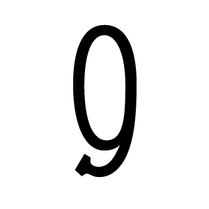 Brought to you by the number: 9
Eccentric, Regular, number 9
Generally speaking, I stay away from the typeface Eccentric. It is a caps-only typeface with a really high x height. It's the sort of typeface that is instantly recognizable; thus, making it more difficult to use as it's not just a blank canvas to be painted (designed) on. Eccentric has its own personality, which with a name like Eccentric is to be expected.
But when I was looking for a number to do this post, Eccentric's number 9 immediately struck me. In my odd mind it reminds me of an abstract rendering of a cartoon whale with it's overly large, oblong bowl for the body and it's bracketed serif as the tail. Now, I don't think this hidden gem makes Eccentric a better typeface necessarily, especially since cartoon-like, and large and whale-like is not representative of the typeface. Not to mention, the 9's oversized bowl is actually in the opposite fashion of the rest of Eccentric that has incredibly high waisted x-heights. However, Eccentric's number 9 is a great enough shape that I'm glad Eccentric, in all it's quirkiness and personality, exists at all.
Courtesy of myfonts.com, itcfonts.com:
Design Foundry: Unknown
Designer: Gustav F. Schroeder
Date: 1881
Classification: Decorative, Art Nouveau
"Eccentric is an all-capital, narrow-bodied, monoline display face that could be described as high waisted. With cross-bars and main junctures more than halfway up the letterforms, every letter - except the W - has a long-legged appearance. Eccentric has a wide range of display uses, from playbills to fashion advertisements."
Awesome find on Eccentric: There was a typophile.com blog thread about what typefaces would best suit historical figures, and someone said that Charlie Chaplin was totally Eccentric. And if you click here, you'll see CC's name in Eccentric as well as a CC poster that really matches well with Eccentric. It's very cool to see such a strong personality (Eccentric) pair up with something else -- I suppose only an equally strong personality would suffice.
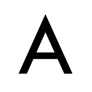
Tuesday, April 27, 2010
Brought to you by the letter...

Today's letter is brought to you by the letter: A.
Drescher Grotesk BT, lowercase A, light.
I'm using Drescher Grotesk BT as my personal branding typeface. And when looking through a bunch of type families, the little, lowercase 'a' was one of the letters in Drescher Grotesk BT that really stood out to me. I liked that it didn't have a head (the line that sometimes appears over a lowercase 'a'), I thought that made it feel a little more modern. I was worried that the bowl was overly large, like the quite distinct lowercase 'a' of Futura. I can see Futura's 'a' coming from a mile away. But really, when put into context, Drescher Grotesk's 'a' is appropriately rounded. It wasn't until I blew it up to 350pt for this post that I saw it wasn't perfectly rounded at all!
In fact, this 'a' looks quite like a closed off Omega symbol. Where the bowl meets the stem is quite angular and feels very Russian constructionist. I really enjoy this because it feels as though Drescher Grotesk's lowercase 'a' is both the beginning and the end.
Courtesy of identifont.com, wikipedia.com
Design Foundry: VEB Typoart (original), Bitstream (digital)
Designer: Arno Drescher, Nicolai Gogoli
Date: 1930, 1999-2001
Classification: Geometric Sans-Serif
Nicolai Gogoli revived Drescher's popular typeface Super Grotesk (?) in 1999 (?) as Drescher's Grotesk and received the Kurt Christians Award. (I can find no information about this KC Award online, other than that Gogoli won it in 1999. Anyone ever heard of it / know what it is?) Drescher Grotesk has seven weights (but no italics) including a small size with wider kerning/leading. It also has the right angle brackets that aren't square brackets: [ ] (and they're still different from these smaller <> angle brackets.)
Drescher's original typeface, Super Grotesk (?) had immense popularity in East Germany (where it was designed) as a replacement for Futura. (No wonder the big bowled 'a's are so similar!). My history is rough at best (please feel free to set me straight): VEB Typoart was the only type foundry in East Germany (under Soviet control). It was state-owned and opened in 1948 in Dresden, three years after the controversial Dresden bombings by the U.S and England. Typoart's mission was "to create typefaces for Eastern Germany and other Eastern Bloc countries. It was frequently ordered to plagiarize Western typefaces that Zentrag could not afford to license."
Tuesday, April 13, 2010
Brought to You be the Letter...
 Today's letter is brought to you by the letter: Z.
Neuropol, uppercase Z, regular.
Before you go telling me that that's not a 'Z' and is rather some messed up angle bracket, let me assure you, it is in fact the letter Z. It is Neuropol's uppercase, regular Z. It's the missing piece of this 'Z' that makes it so interesting. I connect this style with many things - the future, science fiction, aliens, complex/simple dualities. I feel this is the way movies make alien languages/type look. It's familiar to us, yet foreign at the same time. The slightly rounded ends make it feel friendlier / more human, making it not just a typeface for aliens, but also perfect for messages of a futuristic utopia.
Interestingly enough, linotype.com is not found of this open Z, because on it's Neuropol X page (which is an updated version of Neuropol) it states: "If you’re familiar with the old Neuropol, you will appreciate the improvements made to Neuropol X: a refined finish, lighter lowercase stems, improved spacing, and a closed roof Z. [emphasis mine]" Ha. I suppose I'm in the minority for my fondness for this particular Z, but luckily not in liking Neuropol typeface as a whole, as it has undergone many variations and additions.
Courtesy of indentifont.com, larabiefonts.com, myfonts.com
Design Foundry: Larabie Fonts
Designer: Ray Larabie
Date: 1997
Classification: Futuristic Decorative - Geometric Sans Serif Hybrid (or just a Decorative) font.
(Also known as Neuropol Deluxe, but anything else is just a variation of the original. Also, many of Larabie's fonts are free and available for commercial use, which is pretty great. When I say many, I mean hundreds, so definitely check that out.
"The design bridges a stylistic gap between the geometric sans serif fonts of the late 20th century and superelliptical futuristic fonts." - Linotype.com
Neuropol was an instant hit being widely used to promote music, clothing, electronics and techno-toys for the younger generation. I wonder if maybe I like this typeface because I was being subliminally hit with it in the late 90s? Ha. I'm also saddened I couldn't find specific examples of what this typeface was used for - if you see it let me know!
If I haven't completely convinced you of the greatness of Neuropol yet, check out the smiley face character... err, I mean the umlaut character.
 Oh an old poster I did using Neuropol. Hot. Ha.
Tuesday, April 6, 2010
Brought to You by the Letter....
 Today's letter is brought to you by the letter: A.
Twentieth Century, uppercase A, regular.
I definitely really like the way Twentieth Century's uppercase A looks. It's got two strong legs to stand on, where the cross bar is positioned creates a good ratio of white space. But I was worried that it was a little boring. It's a geometric sans-serif, and for the most part, it looks like any other geometric sans-serif. But when I got digging, I found some neat information. (Keep reading)
Courtesy of wikipedia.com and briarpress.org
Design Foundry: Monotype
Designer: Sol Hess
Date: 1937-1947
Classification: Geometric Sans-Serif
Okay, apparently, another geometric sans-serif, Futura made an appearance in the mid 1920s for the Bauer foundry before Twentieth Century (1937-47). Tw Cent is just Monotype's version of a geometric sans-serif. There are others to: Metro, Kabel, Spartan, Vogue etc from different foundries. The differences among them are slim. They're just the licensed version for each foundry. Futura and Tw Cent are essentially the Coke and Pepsi of the type world.
Geometric sans-serifs (GSS) were resurrected in the latter half of the twentieth century with type families like ITC Avant Garde, Century Gothic and Avenir. These new GSSs had less stroke variation (notice how the cross bar is slimmer than the legs in Tw Cent) and higher 'x' heights. The increased 'x' heights made them perfect for children's books. This makes perfect sense, because I can't help but look at that Tw Cent 'A' and think ABCs, even though it's such a cold and unfriendly looking A.
Tuesday, March 30, 2010
Brought to you by the letter...

Today's letter is brought to you by the letter: i.
Alfredo, Regular, lowercase i.
The lowercase 'i' is only important because of it's tittle. Hehehe, she said tittle. The tittle is the dot of the 'i'. And it is what keeps the lower case 'i' from falling into obscurity with the lowercase 'l' and amputated capital 'I'. And the fact that it conforms to the x-height (mean line) rather than the cap-line, also differentiates it from the 'l' and 'I'.
What's great about Alfredo Regular's lowercase 'i' is its stature. It leans away on its hind legs, shoulders back, almost ready to topple over, but really it's ganing momentum, ready to spring forward and throw it's tittle at you. I'm 50-50 on whether the stem gets too thin towards the top. This high thick/thin contrast is reminiscent of a modern typeface. I wonder if it's because 400px wasn't the display size the creator was working for.
In addition, I'm not crazy about Alfredo as a typeface as a whole. It's very 60s, groovy, curvy, decorative, but I think the 'i' manages to capture that attitude without being in your face about it. This is one case where the simplicity of the 'i' works in its favor.
Design Foundry: Unknown
Designer: Unknown
Date: Unknown
Classification: Decorative (?)
Hmm... Alfredo is not getting any hits on the Google radar. If anyone can shed light on this typeface, please do! Many variations of the name Alfredo, but no similar characteristics, very different families. I did however find an actor named Alfredo Font, which is kind of great.
Tuesday, March 23, 2010
Brought to you by the letter...
 Today's letter is brought to you by the letter: !
Zzzap OT, regular, !
Okay, I know the ! is a punctuation mark, not a letter. And no, I never had any intention of doing anything but letters and numbers. But sometimes, you've got to live life on the fly and go where it takes you. Ha. Anyway. A friend recently referred to me a the type girl (which lighted me up inside! Yay!) and he asked what I would typeface I would recommend for a tattoo. He wants to have Don't Panic! written on his arm, a motto taken from The Hitchhiker's Guide to the Galaxy, and pretty sound life advice in general. I sent him over a list, which included some standard sexy sans serifs like Tungsten and Frutiger. But in the back of my head I kept thinking about Zzzap. A font I've recently become associated with thanks to I Love Typography's nifty Font Game iPhone app.
Zzzap looks just the way it's named, like a bolt of electricity went coursing through the edges of the forms. I think it makes for a more interesting and playful tattoo. Although, it probably wouldn't be a very calming typeface to reflect the message of don't panic. If anything, it'd probably keep you panicked and jostled with it's sharp edges and bold forms. I chose the exclamation point for today's letter (mark) because it that mark sums up Zzzap's electricity. The font might as well have been called Zap! or !!!. I also think the ! shape is particularly interesting the way it resembles an retro-style lightening bolt (again with the electricity theme.)
(On a sidenote, I really think my advice to use his own handwriting or that of his mom--or someone close to him--was pretty spot on. What do you think?)
Courtesy of fontshop.com
Design Foundry: Comicraft
Designer: John Roshell, Richard Starkings
Date: 2006
Classification: Decorative
Sunday, March 21, 2010
Personal Branding - Part III
I know it's common for "part III" to suck. (Read: The Godfather Part III, Back to the Future Part III (?) and surely, there are others.) I'm hoping that my part III does not suck. In fact, I am so bold, as to hope that it's an improvement, a showing of progress. Would leave to hear what you have to say about them. All feedback welcome! Thanks again!


Currently, I'm leaning towards 1 or 3. Still working out the colors. (Note: the reds are supposed to be red, not pink.) Oh last minute edition -- too cheesy or okay?

Let me know what you think!
Currently, I'm leaning towards 1 or 3. Still working out the colors. (Note: the reds are supposed to be red, not pink.) Oh last minute edition -- too cheesy or okay?
Let me know what you think!
Tuesday, March 16, 2010
Brought to you by the letter...
 Today's letter is brought to you by the letter: Q
Cooper Black, uppercase, Q
Cooper Black may just be the cutest type face there is. It's bold and dark, but so curvy and soft. What's great about the Cooper Black uppercase Q is how, when taken out of context, it's such an interesting shape on its own. It looks like a little baby squid or something. It's stem (?) looks like a wave or some squishy tail. The angle of the bowl and the stem give the shape movement. Although it's dark and bold it's not static. Can't you just imagine a hundred of them floating against a blue background?
The only drawback to being so cute, in my opinion, is being used incorrectly. Cooper Black can easily feel bubbly and childish, too much so to be any good on posters or company collateral or anything. But when I started researching Cooper Black and saw that it was used on the Tootsie Roll packaging and for Garfield books, it clicked. An unusual use of Cooper Black was for Pet Sounds album cover by The Beach Boys. This is one example that shows Cooper Black's versatility. The type face on the cover looks friendly but not cute.
Courtesy of wikipedia.com:
Design Foundry: Barnhart Brothers & Spindler
Designer: Oswald Bruce Cooper
Date: 1921
Classification: old style serif typeface
Courtesy of Linotype.com:
"The flowing outer contours create forms that are both strong and soft, making Cooper Black an extremely flexible font."
Monday, March 15, 2010
New Poster! Gouker's Senior Recital
Hey all, I recently finished my friend Danny Gouker's poster and invitations for his senior recital. Whoo. Check out the poster below.

Tuesday, March 9, 2010
Brought to you by the number...
 Today's number is brought to you by the number: 2
Courier New, regular, 2.
Courier New's 2 is cute. Not over the top, trying too hard cute, but just sort of like 4-year-old kid smile cute. I like the slenderness of the shape and slabs. It's interesting how the two end points are rounded yet the bottom left angle was kept flat. It provides a solid foundation for the curve on top. The bottom bar with that tiny tail almost looks like an upside down 7. The flat edge and tail help keep uniformity among all the numbers.
If you don't think a number can be cute, or that that a small detail like a flat edge helps type uniformity, well check out Courier New's 6 and 9 below. Definitely not cute. And something about them doesn't feel quite right with the rest of the type face, especially where the line connects back into the shape nor the size of their bowls.
 Courtesy of wikipedia.com, fontco.com and absoluteastronomy.com:
Design Foundry: Monotype (?)
Designer: (?)
Date: 1992
Classification: Monospaced Slab Serif
Courier was originally a monospace slab serif designed by Howard Kettler in 1955 for IBM's typewriters. Originally the typeface was to be called Messenger but Kettler thought, "A letter can be just an ordinary messenger, or it can be the courier, which radiates dignity, prestige, and stability." Courier New was introduced with the release of Windows 3.1 in 1992. I believe but can't find information to confirm, that the primary difference from Courier is that Courier New is anti-aliased. It's shape doesn't have sharp pixel edges, and smooth (see image below.)
Due to it's monospacing and high contrast, Courier New is often used for web coding and ASCII art. It is usually the recommended typeface for screenplays. And it was used as the U.S. State Department's typeface up until 2004 (when it was replaced by Times New Roman.) Courier New has been updated to version 5.00; which includes over 3100 glyphs, covering over 2700 characters per font.
Friday, March 5, 2010
Photographs
Just for the record, I haven't meant to make this blog solely about "Brought to you by the letter...." I'm working on a lot of portfolio pieces, so expect more posts of me begging for critiques. I've also started taking more photos--which I guess should be published on this blog... but they're not, they're being published at my personal blog, Talking With Myself. I think just because I like the layout over there better. :) One day everything will merge together and their will be peace on earth. Until then, feel free to check out Talking With Myself.
Yours,
Heather
Yours,
Heather
Tuesday, March 2, 2010
Brought to You by the Letter...

Today's letter is brought to you by the letter: F.
ITC Blackadder, Regular, lowercase f.
I haven't done a decorative type face in this series yet, but as soon as I saw ITC's Blackadder, I knew that was about to change. What I really love about ITC Blackadder's regular, lowercase 'f' is how evocative it is. With the flowing, long stem and rough edges, it's the perfect typeface to use when writing that message in a bottle. It's an heirloom, a relic of a time when people wrote by hand, sailed ships to new lands, and said words like wench and booty and Jolly Roger without pretension or irony. Something about the actual shape makes me think nautical. Is it the way the stem leans forward, like a boat that forges ahead? Is it the descended extender that imitates a hook? Or the ascender that evokes a hook for a hand? Or the whole shape that was clearly created with a new quill pen and the finest Indian inks over choppy waters?
I think ITC Blackadder does exactly what type should do--evoke a time, a meaning, a place. Sure, it'll more often be used poorly than well, but occasionally (Pirate Day?) it could be used perfectly. I found this example of a wedding invitation using ITC Blackadder. While the typeface does have a romantic edge to it, I think it feel romantic in a lonely, ennui way, not quite the best subconscious feeling for a wedding. What do you think?
Courtesy of fonts.com and myfonts.com
Design Foundry: ITC International Typeface Corp
Publisher: Linotype
Designer: Bob Anderton
Date: 1996
Classification: Decorative
"It was the eerie transformation of insurrectionist Guy Fawkes’ signature after he was tortured that inspired British designer Bob Anderton’s new typeface ITC Blackadder. Basing his design on hand written letterforms typical of the 16th century, Anderton captured the flurried scrolls and curlicues of the era and then added the sinister tremble that defines ITC Blackadder. This elegant, yet menacing display face is perfect for theatrical uses and scare tactics." - Fonts.com
Monday, March 1, 2010
Personal Branding - #2
Here are some things I've been working on. Feedback would be much appreciated.


The variations between these two are slight. Rather than being solid shapes, they're more dimensional in the second one. What I like about this look, is that I can use the shapes within the rest of the collateral to help create a cohesive look. For example, on the letterhead, I could have a row of little T T T T running across the top. (I don't necesarily want people to read the shapes. It doesn't really spell anything - ucatucd?, which is why I brought them down in value. I just want people to see the shapes. But I wonder if you all tried to read it? I got the shapes by removing the bottom half of the word HEATHER.)
I also wonder if all lowercase is better than title care? When I broke the logos down into their small look, the U with lowercase hv looked very bad. And it would probably be funny to mix the two, yes? And I'm still working out the color schemes. It's probably going to be some version of gray, or yellow or red.
Another sort of twist on the same idea:
 This design actually mixes this new dimensional shape with an idea I had earlier, which was to make HV look like a pencil/exacto knife. When I pursued this before, it came out veeeery clip art. See below.

Below are two other previous branding attempts. The first I liked because it feels a bit more personable and less sterile. But it's a very tall logo which I was having issues with. The second one I liked at first, but then someone mentioned "jester" and I couldn't get that out of my head.

 I'd really appreciate any feedback, critiques and suggestions. I think doing your own branding is the hardest thing.
The variations between these two are slight. Rather than being solid shapes, they're more dimensional in the second one. What I like about this look, is that I can use the shapes within the rest of the collateral to help create a cohesive look. For example, on the letterhead, I could have a row of little T T T T running across the top. (I don't necesarily want people to read the shapes. It doesn't really spell anything - ucatucd?, which is why I brought them down in value. I just want people to see the shapes. But I wonder if you all tried to read it? I got the shapes by removing the bottom half of the word HEATHER.)
I also wonder if all lowercase is better than title care? When I broke the logos down into their small look, the U with lowercase hv looked very bad. And it would probably be funny to mix the two, yes? And I'm still working out the color schemes. It's probably going to be some version of gray, or yellow or red.
Another sort of twist on the same idea:
Below are two other previous branding attempts. The first I liked because it feels a bit more personable and less sterile. But it's a very tall logo which I was having issues with. The second one I liked at first, but then someone mentioned "jester" and I couldn't get that out of my head.
Tuesday, February 23, 2010
Brought to you by the letter
 Today's letter is brought to you by the letter: C.
Tungsten, Medium, lowercase c.
I recently did some promotional materials at work, and convinced my boss to buy the Tungsten and Vitesse type families, both from Hoefler & Frere Jones. I thought Tungsten had the right look to fit with our sport, MVP concept. Tungsten is strong, it's tough, and compact. It's a man's man's type. It's not the in-your-face, million dollar, football quarterback type, it's the hold-on-to-your-roots, English rugby player type. You know, rugby guys that knock each other around without helmets and pads. That's some tough shit.
What I appreciate about Tungsten's medium, lowercase 'c', is that it is completely indicative of the entire typeface. It's compact--no unnecessary curves here, and means business. It is essentially a visual chain link, the building blocks of industry. This style of sans-serif was common in industrial, constructionist propaganda. This wasn't a type family that was designed it was built. But rather than being too tough, like an impact or some slab type, Tungsten gets the message across without being intimidating. It's too confident to demand anything. Tungsten knows you'll come along via your own free will.
Courtesy of typography.com:
Design Foundry: Hoefler & Frere Jones
Designer: Hoefler & Frere Jones
Date: 2009
Classification: Geometric (?) Flat-sided (?) Sans-Serif
[They have a really nice write up of their font at their site, I recommend you read it.]
Subscribe to:
Posts (Atom)